Ruby Logo
FlyGo travel app

FlyGo

UI/UX Design User Research Wireframing Hi-Fi Prototype
FlyGo logo and colour system

OVERVIEW:

This project explores how an integrated mobile platform combines fragmented travel functions, from flight booking and airport navigation to real-time flight tracking and UGC, into a seamless digital experience for young travellers.

CONCEPT:

FlyGo brings fragmented travel information into one connected mobile experience. By combining essential travel services, it helps young travellers navigate complex journeys with greater clarity and confidence.

DURATION:

10 Weeks

TOOLS:

Figma, FigJam

ROLE:

User Research & UI/UX Design


01. Overview

FlyGO - Integrated Travel App

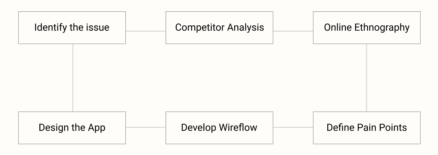
Driven by competitor analysis and online ethnography, FlyGo explores the travel needs and pain points of young travellers. The process identifies key issues across the travel journey and translates these insights into an integrated app.

FlyGo design process

02. Background

Rising Travel Stress & Difficulties

Young travellers often travel on limited budgets, choosing low-cost flights that increase the risk of delays, cancellations and tight connections. At the same time, travel information is often fragmented across different platforms, making flight updates, airport navigation and trip planning more difficult and stressful.

”How might we reduce travel-related stress for young travellers by making travel information and airport navigation easier to access?“

03. Competitor Analysis

Strengths

  • Ctrip: One-stop travel booking and 24/7 customer support.
  • KAYAK: Broad travel search coverage with price alerts and fare forecasting.
  • Ume Trip: Real-time flight updates, airport information and in-flight social features.
  • China Airlines: Direct flight booking with in-app entertainment and digital content.

Opportunities

  • Ctrip: Improve affordability and simplify the experience for budget-conscious travellers.
  • KAYAK: Create a more seamless booking journey without third-party redirects.
  • Ume Trip: Expand booking functions to provide a more complete travel experience.
  • China Airlines: Modernise the UI and improve information hierarchy for easier navigation.

Weaknesses

  • Ctrip: Higher pricing compared with competitors.
  • KAYAK: Booking flow can feel fragmented due to third-party redirects.
  • Ume Trip: Limited booking capability compared with full-service travel platforms.
  • China Airlines: Outdated interface with weaker visual hierarchy and usability.

Threats

  • Ctrip: Strong competition from lower-cost travel platforms and price-comparison services.
  • KAYAK: Competes with integrated platforms that offer a more complete travel experience.
  • Ume Trip: Faces competition from major OTAs.
  • China Airlines: Competes with third-party travel apps that provide broader services.

04. Online Ethnography

Research data - Before/During/After the Flight

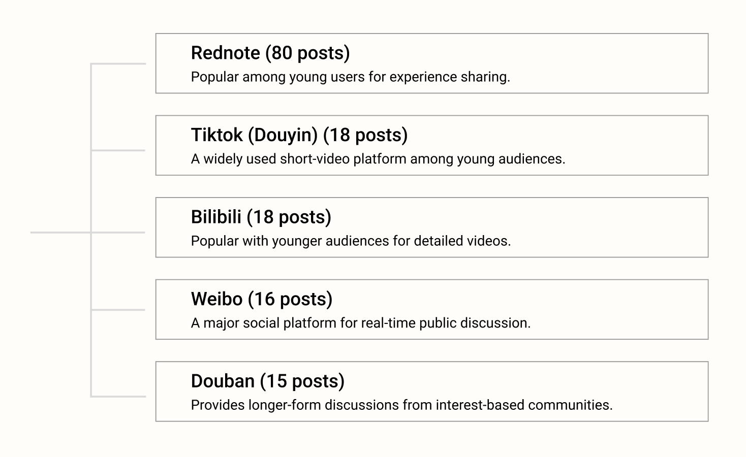
Online ethnography has been conducted by analysing relevant posts and user comments on platforms such as:

Online ethnography research platforms

05. Key Pain Points - Before the Flight

01 / Flight Delays & Cancellations (18 mentioned)

02 / Issues during security check (12 mentioned)

03 / Check-in (10 mentioned)

04 / Process of Visa preparation (9 mentioned)

05 / Unclear Baggage allowance info (6 mentioned)


06. Wireflow

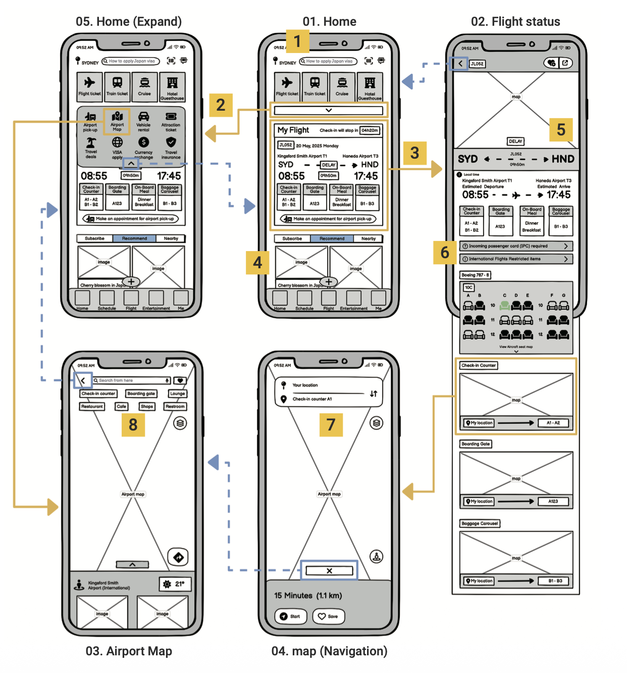
FlyGo wireflow

01. Home

01. Search & Location: Enables topic search and auto-detects user location with manual region switching.

02. Expand Menu: Quick-access hub for extended secondary services (e.g., airport maps).

03. My Flight Card: Instant access to real-time flight status and delay alerts upon entry to reduce search friction.

04. UGC Community Feed: Social travel sharing tailored for young users to build trust and lower travel anxiety.

02. Flight status

05. Comprehensive Details: Displays flight duration, seat maps, gate info, and real-time flight updates.

06. Travel Essentials: Direct access to entry cards (e.g., IPC) and international restriction guidelines.

03. Airport map

07. Indoor Navigation: Interactive airport map guiding users to check-in counters, boarding gates, and baggage carousels.

08. Amenity Shortcuts: Quick-search triggers for nearby facilities like coffee shops, dining, and convenience stores.


07. Heuristic evaluation

5 participants · Prototype usability test · Post-test heuristic survey

The prototype was tested with five target users to evaluate usability, navigation and interface clarity. A post-test survey based on usability heuristics was used to identify key issues and improvement opportunities.

100%

System status was clear

100%

Consistent visual design

80%

Help and guidance were easy to find

40%

Users experienced difficulty recovering from errors

Key Findings:

01 / Navigation clarity

Some users found it difficult to return to the previous screen.

02 / Icon discoverability

Several icons required clearer labels or guidance for first-time users.

03 / Error recovery

Users needed clearer feedback and guidance when an action went wrong.

Design Responds:

01 / Added clearer back-navigation

To help users return to previous screens.

02 / Improved icon labels and guidance

To make key functions easier to understand.

03 / Strengthened error feedback

To help users recognise and recover from mistakes.